Importance of Roof Color Selection
Influence on the overall building appearance
The choice of roof color is undoubtedly a key factor that has a profound impact on the overall appearance of the building. Color, as the first visual impression, can quickly convey the character and style of a building.
In actual architectural design, the choice of roof color needs to be coordinated with the overall style of the building. Taking the famous building in Barcelona – Sagrada Familia as an example, the bright blue color of its roof forms a sharp contrast with the surrounding white buildings, which not only highlights the uniqueness of the building, but also endows it with a sacred and dreamy atmosphere. This choice of color undoubtedly adds a touch of brightness to the architectural style of the whole city.
In addition, the choice of roof color also needs to consider its integration with the surrounding environment. In natural environments, such as forests or mountainous areas, roof colors similar to natural tones can be better integrated into the environment and reduce visual conflicts. In urban environments, the choice of roof color needs to be coordinated with the overall tone of the city in order to maintain the overall aesthetics of the city.
Influence on environmental integration
The choice of roof color is not only related to the aesthetics of the building, but also closely related to the integration of the environment. A roof color that is in harmony with the surrounding environment can enhance the harmony and beauty of the overall environment, while on the contrary, it may appear abrupt and affect the overall landscape. For example, in forested areas, dark green or dark grey roofs tend to blend in better, whereas brighter colors may look out of place.
Environmental integration also needs to be considered in relation to specific geographical and climatic conditions. For example, in the hot south, a white or light-colored roof will reflect sunlight and reduce heat absorption, thus helping to reduce indoor temperatures and improve living comfort. In the colder northern regions, darker shades of roofs are better able to absorb sunlight, increase indoor temperatures and save energy. Therefore, when choosing a roof color, we need to select a color that is both aesthetically pleasing and practical according to the local climatic conditions.
In addition, the choice of roof color also needs to consider the harmony with the surrounding buildings. A roof that is in harmony with the colors of the surrounding buildings can enhance the overall harmony of the building and improve the aesthetics of the city. On the contrary, if the roof color is out of place with the surrounding buildings, it may destroy the harmony of the overall landscape. Therefore, when choosing roof colors, we need to fully consider the colors and styles of the surrounding buildings and choose colors that are in harmony with them.
Influence on residents’ psychological feeling
The choice of roof color is not only related to the aesthetics of the building, but also to the psychological feelings of the residents. Color psychology research shows that color can affect human emotions, behavior and cognition. Therefore, in the choice of roof color, it is necessary to fully consider its impact on the psychological feelings of the residents.
Taking red roofs as an example, red is usually regarded as a vibrant and passionate color that can inspire people’s enthusiasm and vitality. However, overly bright red roofs may make residents feel anxious and uneasy, and even affect the quality of their sleep.
In addition, the choice of roof color should also consider its compatibility with the surrounding environment. If the roof color is out of tune with the surrounding environment, it will bring visual discomfort and psychological pressure to the residents. For example, in areas with abundant green vegetation, dark-colored roofs may appear abrupt, affecting the mood and emotions of residents.
Therefore, when choosing roof colors, it is necessary to take into account factors such as climatic conditions, building materials and architectural styles, as well as their impact on residents’ psychological feelings. Through scientific and reasonable color matching, it can not only enhance the overall aesthetics of the building, but also create a comfortable and harmonious living environment for the residents.
Considerations for Choosing Roof Color
Climatic conditions
Climatic conditions have a significant impact on the choice of roof color. In hot summers, dark-colored roofs absorb more solar radiation, leading to higher indoor temperatures and increased energy consumption for air conditioning and other refrigeration equipment. Conversely, light-colored or white roofs reflect more sunlight, effectively lowering indoor temperatures and reducing energy consumption.
In addition, climatic conditions affect the durability of roofing materials. In humid or rainy areas, roofing materials are susceptible to moisture, mold and even rot. Therefore, it is crucial to choose waterproof and corrosion-resistant roofing materials in these areas. Roof colors should also be chosen for their weather resistance to ensure that they remain aesthetically pleasing and functional for a long period of time. For example, certain special coatings can keep their colors vibrant in humid environments, extending the life of the roof.
It’s worth noting that climatic conditions also affect the compatibility of a roof color with its surroundings. In colder regions, darker shades of roofing blend in better with the winter snow, creating a harmonious visual effect. In warmer regions, on the other hand, roofs in lighter shades blend well with blue skies and green trees, creating a pleasant living environment. Therefore, when choosing the roof color, the local climate characteristics should be fully considered in order to achieve a harmonious symbiosis with the environment.
Building materials
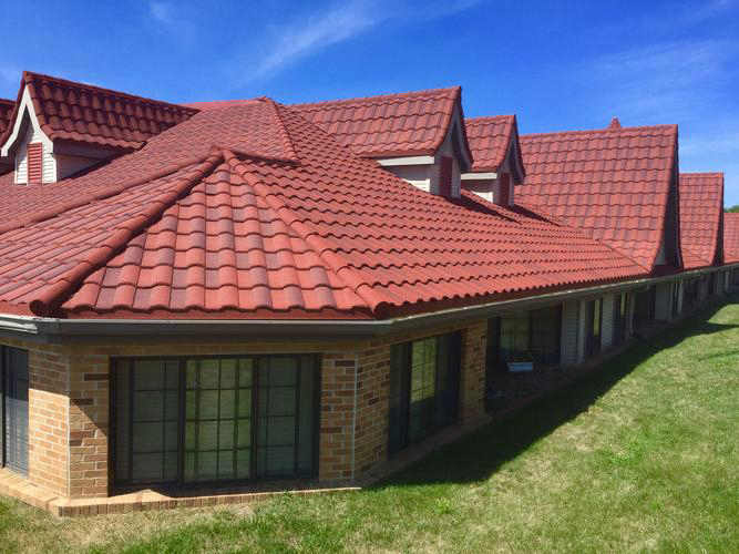
Building materials are a crucial consideration when choosing roof colors. Different building materials have different ability to absorb and reflect colors, which directly affects the final presentation of the roof color. For example, metal roofs usually have a high reflectivity and are suitable for cooler colors such as grey or white to reduce solar radiation and improve energy efficiency. On the other hand, materials that are more heat-absorbent, such as terracotta or concrete tiles, are more suitable for darker colors, such as dark grey or reddish-brown, to absorb more heat and reduce the feeling of coldness in winter. In addition, new environmentally friendly materials such as green roofs should be chosen for their color not only for their aesthetic appeal, but also for their contribution to the environment, such as absorbing carbon dioxide and reducing the urban heat island effect.
The famous architect Le Corbusier once put forward the idea that “architecture is a machine for living”, emphasizing the close connection between building materials and building functions. Similarly, the choice of roof color should also match the function of the building and the building materials. For example, for commercial buildings, bright colors can attract customers’ attention and increase the commercial value; while for residential buildings, soft colors can create a warm and comfortable living environment.
Architectural style
Architectural style is an important reference factor for roof color selection. Different architectural styles have different requirements for roof colors, so the characteristics of architectural styles must be fully considered when choosing roof colors.
Take the Gothic architectural style as an example, its unique spire and flying beam design makes the roof an important part of the building. In this style, the roof is usually dark grey or black, which is in harmony with the overall tone of the building, creating a mysterious and solemn atmosphere. This color choice is not only in keeping with the character of Gothic architecture, but also enhances the integration of the building into its environment.
In addition, the architectural style will also affect the way the roof color is matched. For example, for Baroque architecture, the roof is often decorated with gold or copper colors to show the magnificence and opulence of the building. This way of matching is not only in line with the characteristics of Baroque architecture, but also enhances the artistic effect of the building through the contrast and coordination of colors.
Therefore, when choosing the roof color, we should not only consider the characteristics of the architectural style, but also combine the regional culture and historical background for comprehensive consideration. Only in this way can we choose a roof color that is more in line with the local cultural and historical characteristics and create a cityscape with more regional characteristics.
Policy regulations and restrictions
Provisions and restrictions on roof colors in policies and regulations reflect the importance of urban planning and building management. These regulations aim to ensure the harmony and aesthetics of the overall urban landscape, while taking into account the quality of life of residents and environmental protection. For example, in some cities, the policy stipulates that roof colors must be in harmony with the surrounding buildings in order to maintain the overall aesthetics of the city. Such regulations help avoid color confusion and visual pollution and enhance the overall image of the city.
In addition, policies and regulations also restrict the use of certain specific colors or materials. For example, in order to reduce light pollution and improve energy efficiency, some cities prohibit the use of highly reflective roofing materials. Such restrictions help to reduce the impact of nighttime light pollution on residents’ lives while promoting sustainable building practices.
The regulations and restrictions on roof colors imposed by policies and regulations not only affect the design choices of architects, but also have a profound impact on the lives of residents. These regulations have prompted architects to pay more attention to the harmony between colors and the environment in their designs, and have also reminded residents to consider the interests of the whole community and the overall appearance of the city when choosing roof colors.
Principles of Roof Color Matching
Color contrast and coordination
Color contrast and coordination is the core principle of roof color matching. In the art of roof color, the clever use of contrast and coordination can give the building a unique charm and vitality. Color contrast can highlight the outline and features of the building, while color coordination can create a harmonious and unified visual effect.
In terms of color contrast, strong contrast can produce visual impact and attract people’s attention. For example, the contrast of complementary colors such as red and green, blue and orange can create a sharp and lively atmosphere. This type of contrast is suitable for modern architecture or occasions where individuality needs to be highlighted. However, excessive contrast may also lead to visual fatigue, so it needs to be moderately controlled in practical application.
Color coordination, on the other hand, emphasizes the harmony and unity of colors and the pursuit of overall aesthetics. In roof color matching, co-ordination can be achieved by choosing colors that are similar or of the same hue. For example, the matching of blue-grey and beige can create a fresh and serene atmosphere, which is suitable for quiet residential areas or areas with beautiful natural scenery. In addition, factors such as the brightness and purity of the colors need to be considered to ensure overall color harmony.
In practice, color contrast and coordination are not isolated, but are interrelated and mutually influential. Therefore, in the roof color matching, it is necessary to consider the characteristics of the building, the environmental background and people’s psychological feelings and other factors, and flexibly use the principle of contrast and coordination. For example, in historical and cultural districts, in order to maintain the harmony and unity of the overall style, the way of color coordination can be used; while in commercial areas or creative parks, in order to highlight the individuality and innovation, the way of color contrast can be used.
Color Temperature Sense
The sense of color temperature plays an important role in roof color selection. The sense of temperature of colors, i.e. the warm and cold attributes of colors, can influence people’s perception and emotions towards the environment. For example, warm colors such as red, orange and yellow usually bring warmth, vitality and positive feelings, while cool colors such as blue, green and purple often convey calm, serenity and deep emotions. In the choice of roof color, the rational use of the temperature sense of color can create a visual effect in line with the architectural style and ambience of the environment.
Mediterranean style buildings, for example, are characterized by white and blue as the main colors, with white as the base color and blue used for decoration and embellishment. This color combination is not only in line with the hot, bright climate of the Mediterranean region, but also brings a sense of freshness and tranquility through the cooler shades of blue. At the same time, blue is also believed to have a calming effect and reduce anxiety, creating a pleasant living environment for residents.
Conversely, in some colder regions, architects may choose warm roof colors in order to ward off the cold and add a sense of warmth to the interior. For example, Scandinavian-style buildings often adopt warm tones such as red and orange as roof colors, which are not only in harmony with the surrounding natural environment, but also bring a sense of warmth and comfort to the residents through their warm visual effects.
Symbolism of colors
Colors play a vital role in roof design, not only do they influence the overall appearance of the building, but they also convey deep symbolic meanings. Red, as a vibrant and passionate colour, is often used to express strength, courage and determination. For example, in ancient Chinese palace buildings, red was widely used to decorate the roofs and walls to demonstrate royal authority and dignity. In modern cities, on the other hand, red roofs are often combined with fashionable and avant-garde design styles to add a splash of color to the city skyline.
Practical Approaches to Roof Color Matching
Drawing on natural colors
In the selection and matching of roof colors, drawing on natural colors is a common and creative method. With their harmony, balance and beauty, natural colors provide endless inspiration for roof design. For example, a dark grey roof can mimic the tones of rocks or trees, blending in with its surroundings to create a quiet and natural atmosphere. Light colored roofs, such as pale blue or beige, on the other hand, reflect sunlight and reduce the heat island effect, while mirroring the sky and clouds.
Drawing on natural colors is not only aesthetically pleasing, it also has a scientific basis. Color psychologists believe that natural colors can trigger positive emotions such as calmness, relaxation and pleasure. For example, green is seen as a symbol of life and hope, relieving stress and promoting physical and mental well-being. Therefore, incorporating green or other natural colors into the roof design not only enhances the aesthetic value of the building, but also creates a more comfortable and healthy living environment for residents.
In practical application, drawing on natural colors requires comprehensive consideration of a variety of factors. First of all, it is necessary to understand the local climatic conditions and natural environment, and choose the roof color that is in harmony with it. Secondly, the performance and durability of the building materials should be taken into account to ensure that the selected colors can remain bright for a long time. Finally, it is important to combine the architectural style and overall design concept to create a roof that is both aesthetically pleasing and functional.
The Sydney Opera House in Australia, for example, uses white and light grey tiles on its roof to mimic the hues of the local rocks and sky. This design not only harmonizes with its surroundings, but also reduces indoor temperature and energy consumption by reflecting sunlight. This case fully demonstrates the practical application and effect of drawing on natural colors in roof design.
In conclusion, drawing on natural colors is an important method in the selection and matching of roof colors. Through in-depth understanding of the natural environment and climate conditions, combined with architectural style and design concepts, we can create both beautiful and practical roof color schemes.
Reference to neighboring buildings
When exploring the art of roof color, referring to the surrounding buildings is undoubtedly an important step. Through in-depth understanding and analysis of the color characteristics of the surrounding buildings, we can more accurately grasp the art of roof color, and thus choose the most appropriate roof color for our own building. As the famous architect Le Corbusier said, “Color is part of the building, it gives life to the building.” Therefore, in the choice of roof color, we should give full consideration to the harmony and unity of the color with the building and with the environment, in order to create a better cityscape.
Innovative Matching Method
Traditional roof color choices are often limited to fixed color combinations, lacking individuality and creativity. Innovative matching is not only reflected in the choice of colors, but also in how to combine these colors cleverly. For example, the gradient design can be used to make the roof color gradually transition from one color to another, creating a sense of flow and three-dimensional sense. This design approach can not only increase the aesthetics of the roof, but also harmonize with the surrounding environment and improve the integration of the overall building. In addition, patterned designs, such as wave patterns and geometric shapes, can also be used to make the roof color more colorful.
SKW is Committed to Meeting All of Your Roofing Needs
SKW creates every color our clients want. Our excellent customization capabilities enable us to help you create your ideal house! What truly sets SKW apart is our commitment to leading the way. Our design and production prowess is not confined by borders; it sets the benchmark within the Chinese roofing industry. We stand at the forefront, delivering roofing solutions that exemplify excellence and innovation. Browse at our existing products to choose a favorite color and let us know!